Sunday, February 27, 2011

Hemingway's iceberg - minimalistic

I mentioned Ernest Hemingway's style in a comment on my post "Personify," but the subject should be blogged. Towards the end of the post I will explain the narration of my comic strip "The Affair."


Hemingway called his minimalistic style the iceberg theory, where only 10% of the information is given.  In a story, he eliminated all that the reader can assume, leaving what the reader could not assume.  Just the essentials, or the minimum, needed to understand the story.  


David Malki, creator of Wondermark.com, has a visual example of this style improving content. The Garfield strip below is redundant through the visual and text. 
Malki states, "the punchline is set up twice and delivered twice." 
Here is Hemingway's theory of just the essentials applied to the strip:


Malki on the strip above: "It allows the reader to connect the dots, and engages them in the narrative.  It leaves room for interpretation, and for Garfield’s true thoughts to only sound in the theater of the reader’s mind."


Without the speech bubble in the first panel, the reader can interpret that Garfield's throwing the ball for fun. As soon as the Odie, the dog, is spotted, the game of catch is determined.  So redundancy killed the humor because all the interpreting work, in a reader's role, is done already, leaving  the reader no reason to linger on the story.  


For more on Garfield, look up Eric Burns who Malki referred to as the one who noted Garfield's redundancy.  Malki has more posts on newspaper comic strips in Comic Strip Doctor


In my comic strip project, "The Affair," I intended to state what the reader is less likely to determine on his/her own.  Click the image for a full view.
I never describe the affair mentioned in the title because the reader can interpret the Jack's  interest in the Queen from his shortened distance. If I state that the Jack moved closer to the Queen, then text would be redundant.  Instead I narrate the actions and feelings of the other characters which cannot be easily determined from the visual. The minor characters get their story in the captions because the main story is visible enough.


The next time a story seems to be about nothing check if you, the reader, have interpreting work to do.  


For writing, this minimalistic style is more difficult because the information is all text.  The easier cases are dialogue and description.  Do the character's repeat too much of what the narrator states?  Inner dialogue, thoughts, typically do not need to be repeated in conversation.  Having someone read your story can help to determine what can be assumed and what cannot.


Can you think of an example of this minimalistic style or a story that could use it?

Tuesday, February 15, 2011

Personify

I once tested out the filters on my camera phone in my backyard and came up with this movie trailer spoof:
I was just messing around until I saw how the first photo shown looked like a drama to me. So I messed around more to create a story.  It was fun and received laughs from family and friends.  I had also personified the animals by making them human-like in a relationship drama context.

I still like how a story can be created with anything.

In my Visual Cultures class, I found examples of personification through Edward Gorey's."The Animated Tragedy" (a page is shown below) and "Bug Book."

For my final in that class, I decided to make a comic on personified objects. Because I like the look of poker cards, I chose them as my objects. So I made a drama about cards moving closer and away from each other as a hand of cards.

I aimed to keep the captions casual and like a children's book as I saw Edward Gorey did for even his dark stories. I never mentioned the affair after the title.

For the final, I had printed out black and white.  Since then I photoshopped the images to make them more flat and give more dramatic lighting.  The piece will go in my school magazine. =)  Once again, I had fun. and I hope I do more personified works. What do you think?

If you're interested in Edward Gorey, then I recommend Amphigorey.

Monday, February 7, 2011

MegaMind - appearances

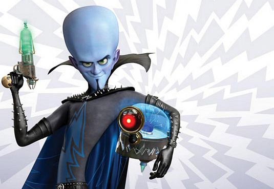
Just saw MegaMind at a $3 theater.  I did not expect much from the movie, but I found myself laughing and  surprised.  Also, it has a lot of character exploration for MegaMind.  Along with learning his life story, I think the audience cares for him because his character design is not all threatening.

From memory, I thought MegaMind had a sharp, pointy chin but he doesn't. Although the lower portion of his head is angular, his head is mostly round.  Sharp angles look threating while round is safer.  Yes, he does have the sharp studs, but they're tiny.  His collar too has points, but it rounded with the curves like his elbows. His body too creates a long curve.  The long, skinny body makes him odd-looking, which could be perceived as strange enough to be feared.  However, he says odd, funny things so the odd look is considered funny as well.

Aku from Samurai Jack has pointed ends, edges, and angles that make him look like a real threat. Look at just his teeth.  The way they curve out is strange, which this time does evoke fear. Aku can be funny sometimes but he is still recognized as a threat.

Look at these two:

MegaMind looks threatening only by the larger studs.   The collar is taller now but has lost its points. Titan/Tighten on the left looks more menacing just by his expression.  His face is round too but more angular than Mega Mind's face. Perhaps the Tighten's fiery colors add to the threat. He looks like dangerous fire.  MegaMind could look threatening with the blue and black by evoking a cold and dead personality but he shows emotions that gain sympathy. The red/pink/purple on his ears, nose, and cheeks too make him look less dead. The color reminds us that he's a living being with blood running through him.

Overall, MegaMind looks like a villain but he doesn't sell it like Aku and Tighten.

Although I'm talking about a movie, these visual factors can apply to a prose description of a character too.  A villain with a sharp chin rather than a round or large chin sounds more threatening. Colors can also portray the character's personality and nature but because the reader has to visualize the image, just a few colors should be used at a time.  An author points out the features to look at by stating them.

It's up to you writers and artists if you follow or break down the first impression of characters, but a first impression should be given for the audience to react to the character's arrival.