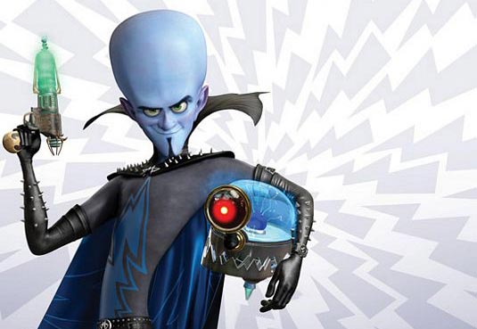
Just saw MegaMind at a $3 theater. I did not expect much from the movie, but I found myself laughing and surprised. Also, it has a lot of character exploration for MegaMind. Along with learning his life story, I think the audience cares for him because his character design is not all threatening.
From memory, I thought MegaMind had a sharp, pointy chin but he doesn't. Although the lower portion of his head is angular, his head is mostly round. Sharp angles look threating while round is safer. Yes, he does have the sharp studs, but they're tiny. His collar too has points, but it rounded with the curves like his elbows. His body too creates a long curve. The long, skinny body makes him odd-looking, which could be perceived as strange enough to be feared. However, he says odd, funny things so the odd look is considered funny as well.
Aku from Samurai Jack has pointed ends, edges, and angles that make him look like a real threat. Look at just his teeth. The way they curve out is strange, which this time does evoke fear. Aku can be funny sometimes but he is still recognized as a threat.
Look at these two:
MegaMind looks threatening only by the larger studs. The collar is taller now but has lost its points. Titan/Tighten on the left looks more menacing just by his expression. His face is round too but more angular than Mega Mind's face. Perhaps the Tighten's fiery colors add to the threat. He looks like dangerous fire. MegaMind could look threatening with the blue and black by evoking a cold and dead personality but he shows emotions that gain sympathy. The red/pink/purple on his ears, nose, and cheeks too make him look less dead. The color reminds us that he's a living being with blood running through him.
Overall, MegaMind looks like a villain but he doesn't sell it like Aku and Tighten.
Although I'm talking about a movie, these visual factors can apply to a prose description of a character too. A villain with a sharp chin rather than a round or large chin sounds more threatening. Colors can also portray the character's personality and nature but because the reader has to visualize the image, just a few colors should be used at a time. An author points out the features to look at by stating them.
It's up to you writers and artists if you follow or break down the first impression of characters, but a first impression should be given for the audience to react to the character's arrival.


No comments:
Post a Comment