

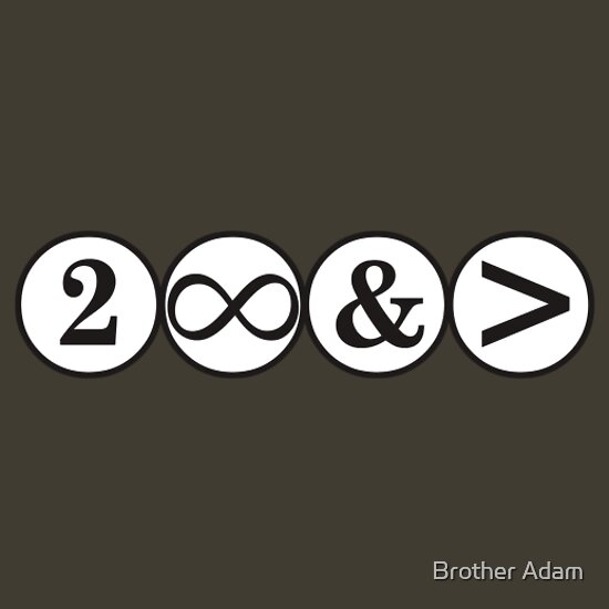
Friday, December 28, 2012
Poe Boy
I don't know who drew the sketch down below, but thank you for involving the raven. I am a fan of birds.

Monday, December 17, 2012
Hens Walk Calendar
 |
| "Hens Walk 2013" |
In January, I am excited to have the image on shirts. I will write a post for them when they're available.
Thursday, December 13, 2012
Critters and Lego Figures
Another Lego joy I had to share. RedBubble artist Powerpig has a fun Lego calendar called "Backyard Adventures" for $26. Each month holds a captured moment of a squirrel collecting peanuts in the middle of a Lego scene. I don't know how the photos were managed, but are some of my favorites:


The artist has more Lego calendars available for $23 such as this one:
 |
| "Never a Dull Moment II" |
Lego TMNT
TMNT Lego figures are coming out in January! Here is a video with a sneak peek of the Lego sets and details on designing them.
Part 1: The figures
Part 2: The environments
(I laughed at the exploding wall)
Like any other fan, I want to get at least the turtle and Shredder figures. I enjoyed hearing about the design process. What do you think?
Friday, December 7, 2012
Free Shipping
In the last post, I shared an art piece on RedBubble and Society6. Well, both sites have free shipping for a few days.
RedBubble
Free shipping until Sat Dec. 8 6:00am.
I have only "Night's Kiss" on RedBubble so far, but I wanted to share a clever tee (on the right) I found for Buzz Lightyear fans. ;)
 |
| My tee again, "Night's Kiss." |
 |
| The title gives it away, but here's the link. |
Society6
As for Society6, purchases will have free shipping if you click on the artist's promo link for it. Here is my free shipping promo link: http://society6.com/Inque?promo=1cee54 . Free shipping on this site is until Dec. 9.
And here are two other artist's works and promo links:
Artist Terry Fan
 |
| "Autumn Song" |
 |
| "Your brain on video games" |
Artist Martynas Pavilonis
 |
| "Martwood Wolves" as a phone skin. |
 |
| "Village" |
Tuesday, December 4, 2012
My First Tee Design
|
| "Night's Kiss" |
After reading Batman: Hush comics, I was inspired to draw Batman and Catwoman in the pose of the Art Nouveau painting "The Kiss."
 |
| "The Kiss" |
For the tee design, I went with the WB animated series outfit for Catwoman. As for Batman, the cape is the color of the shirt you choose. Your choice affects Catwoman too.
 |
| Shirt color options. |
The image is also available on Society6 as a print, iPod case/skin, and laptop skin. Plus I have "Night's Kiss II," which has a night city background.
 |
| "Night's Kiss II" as a laptop skin. |
Thursday, November 29, 2012
Balloon Hats
A few changes can be enough for a story.
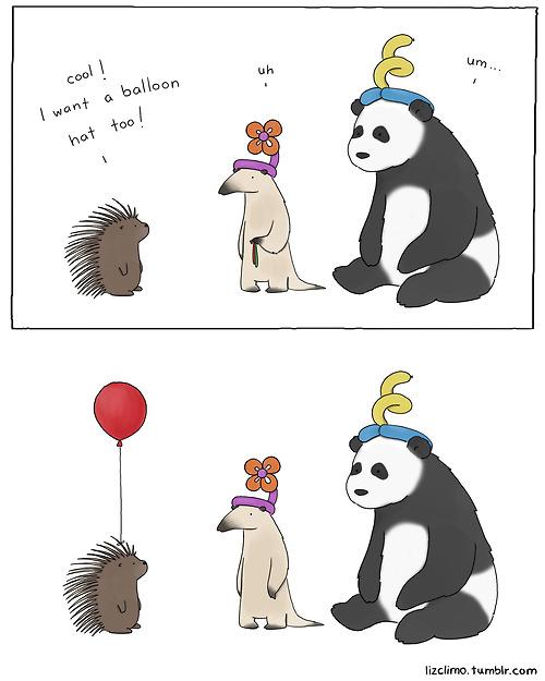
The expressions didn't changed, but the silence is enough to express the moment. I hope you got a chuckle from this comic. :)
The expressions didn't changed, but the silence is enough to express the moment. I hope you got a chuckle from this comic. :)
Monday, November 5, 2012
Redesign a Book Cover
 |
| Original cover |
Judging: The author chooses ten finalists, and then the public votes for those ten.
Prizes: Finalists get a signed copy of the book while the winner gets a signed copy and recognition for his/her winning entry as the new book cover.
Last month I entered the False Memory book cover contest. My entry was not selected as a finalists, but you can vote here until November 9th if you have a Facebook account. I root for four finalists. The winner will be announced on November 12.
Here is my entry done on Photoshop.
 |
| My entry |
* How to play with title?
* How much of the story to tell? (I researched reviews.)
* How to target both genders?
Thoughts after entering:
* The author's name needs stand out a bit more.
* Try altering faces more to look less like referenced faces.
* I tried a clean look, but next time try background texture, which most young adult books have.
* The contest was a good exercise for design and Photoshop.
Because contests are not just about winning, here is one of my favorite postmodern quotes from Sonmi-451's section in Cloud Atlas:
So winners, Hae-Joo proposed, are the real losers because they learn nothing? What, then, are losers? Winners?
 |
| Original cover |
I probably will not enter the Beta contest because I want to finish a few current projects. There is 11 days left if I change my mind. The book synopsis actually reminds me of Sonmi-451 .
In this case, I root for Ashley's "I am a Beta" entry. =) I left a comment on her entry. Voting for this contest is not open yet.
 |
| Ashley's entry |
For any Figment contest, I recommend checking contest details at least weekly. In both of the writing and book cover contests I entered, details including the deadline were changed without an announcement or email. In the writing contest, the deadline change did not work in my favor. =/
Good luck if you enter. Make the process a fun learning one.
Sunday, October 7, 2012
Selfish, but Cute, Hedgehog
As a fan of wordplay, I had to share this tee design:
Cute little guy with a small speech bubble.
 |
| "Hedgehogs Can't Share" tee for $19.95 |
Thursday, October 4, 2012
Cowabunga!
Along with Halloween, October is National Pizza Month. So how about looking at some big fans of pizza, the Teenage Mutant Ninja Turtles (TMNT).
Nickelodeon promoted the more recent series with this chalk illusion in London. I am sure that everyone wishes the drawing was a permanent mural.
More and more TMNT printed tees are coming out probably because of Micheal Bay's TMNT film reboot.
However, On the UK website The Guardian, I read that the 2013 film pushed back to 2014 because of the fans' voiced disapproval of the mutant turtles portrayed as aliens. The Guardian believes the production may be dropped altogether.
An artist, Billy Allison, did a great depiction of the ninjas like Ridley Scott's Alien. I linked the tee's title to prints and device covers, but he has the design available as a tee too.
Here's two tees that take after the turtles' names: Leonardo, Raphael, Michelangelo, and Donatello.
Did you know that Teenage Mutant Ninja Turtles was a comic before a TV show? How about that all four wore red?
Artist Hillary White knew. Her design on the right is no longer available at RiptApparel, but you can still get a $15 print. It is a mash-up of one of Queen's album covers.
Even when dressed the same, Raphael stands out.
There are more TMNT tees, but don't forget to celebrate National Pizza Month.
I have always wondered if banana toppings tasted good. Do you remember what other toppings these turtles tried?
 |
| "Vote Pizza Party" classic 80s tee for $20 |
 |
| Hello, Raphael. |
 |
| "Ancient Ninja Xenomorphs" |
However, On the UK website The Guardian, I read that the 2013 film pushed back to 2014 because of the fans' voiced disapproval of the mutant turtles portrayed as aliens. The Guardian believes the production may be dropped altogether.
An artist, Billy Allison, did a great depiction of the ninjas like Ridley Scott's Alien. I linked the tee's title to prints and device covers, but he has the design available as a tee too.
Here's two tees that take after the turtles' names: Leonardo, Raphael, Michelangelo, and Donatello.
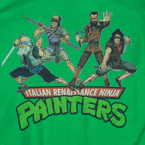 |
| "Renaissance Ninjas" tee for $22.50 |
 |
| "Heroes in an Art Shell" tee currently sold out. |
 |
| "Ninja Rhapsody" print for $15 |
Artist Hillary White knew. Her design on the right is no longer available at RiptApparel, but you can still get a $15 print. It is a mash-up of one of Queen's album covers.
Even when dressed the same, Raphael stands out.
| Original TV show in the 80s |
I have always wondered if banana toppings tasted good. Do you remember what other toppings these turtles tried?
 |
| I did not find a tee or print of this one, but it is still worth sharing. |
Tuesday, September 18, 2012
Half-way Through Insignia
Insignia is a new Young Adult (YA) Sci-Fi book published this past July. I found about it from the Dark Days of Summer promotional event for YA dystopias such as Insurgent by Veronica Ruth. I did not attend the event, but it was successful if non-attendees read the books because of the promotion. The first half of Insignia has more military and cyber themes than a dystopic theme.
Reviewers on GoodReads.com described Insignia as "Ender's Game and Harry Potter." Kid recruits are divided into divisions according to talents, but the half point of the book is when it feels more like Hogwarts. The hacker attacks and divisions points reminded me of wizard duels and the houses. By the way, a hacker's target is more personal than your computer. I leave that aspect for you to find out because it is part of the main story for the series.
Reviewers on GoodReads.com described Insignia as "Ender's Game and Harry Potter." Kid recruits are divided into divisions according to talents, but the half point of the book is when it feels more like Hogwarts. The hacker attacks and divisions points reminded me of wizard duels and the houses. By the way, a hacker's target is more personal than your computer. I leave that aspect for you to find out because it is part of the main story for the series.
| Still need to look good for the camera. |
I recommend Insignia. The beginning may feel too young for older audiences, but hang in there until Tom Raines, the main character, is recruited. It has numerous fun moments and conflicts. The characters have more depth than in The Maze Runner.
Insignia is a series like all the other books I listed. I am not going to read the next installment of I, Robot: To Protect or The Maze Runner, but I am eager for Kincaid's book after Insignia.
Let me know if you read Insignia. =)
Insignia is a series like all the other books I listed. I am not going to read the next installment of I, Robot: To Protect or The Maze Runner, but I am eager for Kincaid's book after Insignia.
Let me know if you read Insignia. =)
Wednesday, July 25, 2012
Using the Little Details
 |
| Click for a closer view of listed areas and details. |
I appreciate that little detail because I do not enjoy reading descriptions that stray from the story too much and disrupt the flow.
For example, in I Robot: To Protect, the amount of detail given to food annoyed me most during a conversation. The narrator stated delight in the person on this date, but her attention was more on the food. Each described bite felt like a tree in my way as I tried to follow the conversation's direction.
Therefore, I try to describe to illustrate a character's feelings or to set the tone. If I describe to help the reader imagine an object, then giving tangible details like Johnny's pressed lines help the reader remember having felt the object before. Kudos to you if your readers feel as if they have held that object without having touched or seen it before.
The only thing I would change in Johnny's image is to make an edge of the package bend. This detail makes the representation less perfect, but more familiar. He wanted perfect symmetry though. Plus the package bend can draw your eye away from the main content.
Thank you to my sister for the Snickers ice cream bar at this moment. Now for ice cream that I can actually experience.

Sunday, July 8, 2012
Cancer Walk
 |
| My sister is on the left. |
If you'd like to donate, then Therese's page is HERE. Donations can be made online or by phone.
Donations are tax-deductible, but you have to put your name instead of 'Anonymous." Double check with you tax adviser though. You will receive an email receipt.
No cash donations. International donations are accepted only by credit card.
Thank you for donating or sharing Therese's page. =)
Saturday, June 16, 2012
Love Me, Stalk Me

Why do some love stories (even in genres other than Romance) depict stalking as flattering and romantic? A 1st person perspective narrator can show other characters to the reader by stalking them, but even detectives face trouble for doing so. Stalking is a wrong kind of attention. A pet peeve of mine is when the fictional love interest has no social life, job, or actitivies so he can attend to the main character 24/7 and rescue if necessary. That love interest usually stalks.
By the way, The Merchant's Daughter is a spiritual retelling of Beauty and the Beast. The author Melanie Dickerson explored appearances as well as love vs. lust (with stalking). Some lines were repetitive and some problems disappeared at the end, but I still liked the book. The setup is more like Jane Eyre in terms of servant and Lord.
A common conflict or climax for heroines is kidnappings. I do not mean just for romances. Heroines tend to be threatened personally more often than male heros, who have battles, obstacles, time-limits, or his beloved is threatened. My concern is for readers getting the wrong idea of romance and for more developed storylines for heroines.
Let's look through classic film monsters for women stalked or kidnapped (spoilers):
Frankenstein's Monster: He observes humanity. He stalks the Frankensteins and kills a woman, but for revenge against Dr. Frankenstein.
Dracula: Stalks, kills, and tried/succeeded in kidnapping depending on version.
The Mummy: Stalks and kidnaps.
Swamp Thing: Stalks and kidnaps.
Phantom of the Opera: Stalks and then later kidnaps.
King Kong: She's kidnapped by a tribe as sacrifice. Later Kong kidnaps her.
Some viewers find the stalking monsters as exciting in the romantic sense. Yes, the monster is drawn strongly to the girl, but no matter the degree of passion it is the antagonist. Yes, the woman is desired, but why must her life be threatened for attraction? Not all passions are romantic.Sidenote: I roll my eyes at the King Kong line, "It was Beauty that killed the Beast." Let's not blame the ones who brought him to the city. That she-devil. Looking sexy in a torn-up dress and screaming to show off those pearly-white teeth.
King Kong 1933

Those were old examples, but these type of stories still exist. Look at contemporary books of urban fantasy, dark romance, and supernatural romance. How many of them have the heroine stalked, kidnapped, in danger of rape, and/or forced to date/marry?
Another book I read for my Beauty & the Beast research was The Hollow Kingdom (2006) (some spoilers). It is divided into 3 sections. The first section has stalking and kidnapping.
Me: I like that this book shows kidnapping as bad.
Sis: Kidnapping is bad.
Me: I know kidnapping is bad.
Sis: I'm glaad you do.
Me: I mean they don't make it romantic. Like some books do. It justifies the kidnapping, but it's still bad.
Sis: They justify it?!
Me: Yeeeah.. but it's shown still as bad. The goblins don't care--which is bad--because they do it to survive. Instead of the author turning the kidnapping around as romantic. It's still bad.
 |
| Stalked girl does not look happy. Does stalking make her more desirable or pretty? |
Eventually, the girl fell for the goblin kidnapper (kind of just happened), , Some reveiwers called it Stockholm Syndrom.
Fortunately, kidnapping is not the only exciting event in the book. The heroine got a chance to prove herself in the third section. I liked the protective charm. In addition, the author turns the arrangement around through changed perspective, which I will cover in another post.
The Hollow Kingdom was still a good example of a new bride's fears in my Beauty & the Beauty research. I recommend having that thought in mind while reading the book. The Merchant's Daughter is the healthier love story.
What do you think of this topic or The Hollow Kingdom?

Saturday, June 2, 2012
Rape Myths & Stats
3 of the last 4 movies for my family's movie night had a rape--Woody Allen's movie was the exception. Most of the rapists were not a stranger to the girl. Stats show that this is often the case, but it is still surprising.
Some years ago, I spoke to two high school reluctant readers for my English Education class. Once again to my surprise, most of the books on their recommended reading list had racism, violence, and rape.
A friend recently shared an article that proved rape advice in "Through a Rapist's Eyes" as wrong information that leads a girl's suspicion away from the most common locations and perpetrators of rape. The fact is, "70-80% of rapists are well known to their victim." The article is worth sharing. Thank you to my friend for sharing it.
The article also argues that victims of rape are usually blamed and have the hardest time proving the crime than with other crimes.
And finally, I researched some fairy tales this last semester. For "Little Red Hiding Hood," I came across Against Our Will: Men, Women and Rape. The author, Susan Brownmiller, helped organized conferences on rape in the 1970's. As a journalist, she investigated rape in newspapers, media, and crime stats. On her book, Newsweek stated:
I will share other aspects of my fairy tale research as well. Thanks for reading this blog post.
Some years ago, I spoke to two high school reluctant readers for my English Education class. Once again to my surprise, most of the books on their recommended reading list had racism, violence, and rape.
A friend recently shared an article that proved rape advice in "Through a Rapist's Eyes" as wrong information that leads a girl's suspicion away from the most common locations and perpetrators of rape. The fact is, "70-80% of rapists are well known to their victim." The article is worth sharing. Thank you to my friend for sharing it.
The article also argues that victims of rape are usually blamed and have the hardest time proving the crime than with other crimes.
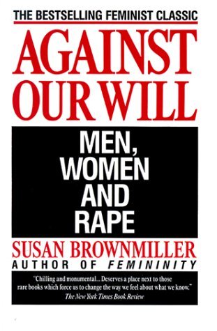 |
| Published in 1975. |
The most comprehensive study of rape ever offered to the public...It forces readers to take a fresh look at their own attitudes toward this devastating crime.One aspect Brownmiller brought to light was that rape is an act of power that "[keeps] all women in a state of fear." One argument against the book is that men can fight in the cause too.
I will share other aspects of my fairy tale research as well. Thanks for reading this blog post.
Saturday, May 26, 2012
The Best Story Structure
One of my favorite teachers advised to make character development the structure instead of following structure formulas. By page blah blah blah have an explosion.
The class was for screen adaptation, but the advice applies to any story. =) I improved the beginning of a story by working on the characters' journeys and goals.
Another screenwriting teacher did not believe in writer's block. She suggested to check if you strayed from the story's path at one point. Perhaps you put in a scene for its own purpose instead of the whole story's purpose. Sometimes you have to let go moments or lines. Save the draft though because you could try using that scene in another story.
Screenwriter Nicholas Meyer wanted to express his dislike of punk rock music through the time-traveling hero in Time After Time. Meyer had to omit the scene, but he rewrote it in Star Trek IV: The Voyage Home. I found the well-known scene, but the song was changed:
Friday, May 25, 2012
I'm with the Mockingjay
I heard some readers felt emotionally-drained from Mockingjay, the 3rd book of The Hunger Games. I enjoyed it because it had concepts similar to Nineteen Eighty-Four. =) Catching Fire was the emotionally-draining book for me. I felt that Katniss was weighed down by her worries.
There's some spoilers in this post even though I indirectly talk about them.
In the drawing, I wrote vague terms for what I thought were Katniss' main worries in each book before the games. I added trees because nature is her relief. With each book, she is more cut off from it. Dystopic societies usually cut people off from nature or see it as too wild.
Also this series shows nature used as and altered into a weapon. However, nature continues to live as if independent from the story's events. Man suffers and struggles to survive because of man.
In The Hunger Games, Katniss was a survivor but she was numb. Her main focus and devotion was her family's survival.
At this point, she doesn't know that other districts suffer just as bad or worse. Her own district has had worse days, which the adults recall.
In Catching Fire, she should no longer have to worry about her family, but Snow proves that fact wrong and adds more worries to her list. Katniss fears even her own actions and the interpretations of her actions because of consequences.
For fans of the love story/love drama, the second book seems to be their favorite.
I feel that Katniss had the most spirit in Mockingjay. She rebelled at almost every moment. She wants to be more informed on situations. She acts more than fearing on acting. Because of this strong spirit, I was not shocked at her move during the peace ceremony.
I had hoped for that move because the leaders fit George Orwell's attitude in Nineteen Eighty-Four that all parties are the same. The people still had to trust a leader blindly. Some people still feared for their lives. Daily life was controlled by the leader. The rebel society still lacked humanity. In the final conference, Katniss states that things are still the same.
I could not think of a right replacement for Snow, but when author Suzanne Collins showed the final leader, I agreed strongly with the choice. That person had showed interest in the people and had suffered from the Capitol.
Mockingjay is perfect...if you expect a dystopia. The first book had the dystopic setup, but was told as an adventure thriller. The second book is the transition to dystopic. Mockingjay is the dystopia of the series. I felt that Collins held back themes and attitudes in the other books. Mockingjay explains the society such as the careers in the games. This book may be my favorite of the three because of these reasons. The first book is still a great example to me of constant conflicts and the audience's influence.
I say perfect, but the book is not flawless.
The reader may get confused when the pace is too fast for storytelling near the end, but you are put in Katniss' position. You feel the rushed moment as she does.
The ending is short and quick, but I am fine with that. Although I read the book over a week instead of a few days like some readers, I needed the story to end already. You feel burnt up by the events and need relief from the tension. I recommend stopping once in a while because of the numerous events and their impact.
If you have not read Nineteen Eighty-Four, then I recommend doing so including the prologue or section about George Orwell. I was just told that the districts and Capitol in The Hunger Games are similar to Brave New World. I bought a copy, but I'm taking a break again from dystopias.
There's some spoilers in this post even though I indirectly talk about them.
In the drawing, I wrote vague terms for what I thought were Katniss' main worries in each book before the games. I added trees because nature is her relief. With each book, she is more cut off from it. Dystopic societies usually cut people off from nature or see it as too wild.
Also this series shows nature used as and altered into a weapon. However, nature continues to live as if independent from the story's events. Man suffers and struggles to survive because of man.
 |
| I have a drawing tablet now. I'll try quick sketches to illustrate points. |
At this point, she doesn't know that other districts suffer just as bad or worse. Her own district has had worse days, which the adults recall.
In Catching Fire, she should no longer have to worry about her family, but Snow proves that fact wrong and adds more worries to her list. Katniss fears even her own actions and the interpretations of her actions because of consequences.
For fans of the love story/love drama, the second book seems to be their favorite.
I feel that Katniss had the most spirit in Mockingjay. She rebelled at almost every moment. She wants to be more informed on situations. She acts more than fearing on acting. Because of this strong spirit, I was not shocked at her move during the peace ceremony.
I had hoped for that move because the leaders fit George Orwell's attitude in Nineteen Eighty-Four that all parties are the same. The people still had to trust a leader blindly. Some people still feared for their lives. Daily life was controlled by the leader. The rebel society still lacked humanity. In the final conference, Katniss states that things are still the same.
I could not think of a right replacement for Snow, but when author Suzanne Collins showed the final leader, I agreed strongly with the choice. That person had showed interest in the people and had suffered from the Capitol.
Mockingjay is perfect...if you expect a dystopia. The first book had the dystopic setup, but was told as an adventure thriller. The second book is the transition to dystopic. Mockingjay is the dystopia of the series. I felt that Collins held back themes and attitudes in the other books. Mockingjay explains the society such as the careers in the games. This book may be my favorite of the three because of these reasons. The first book is still a great example to me of constant conflicts and the audience's influence.
I say perfect, but the book is not flawless.
The reader may get confused when the pace is too fast for storytelling near the end, but you are put in Katniss' position. You feel the rushed moment as she does.
The ending is short and quick, but I am fine with that. Although I read the book over a week instead of a few days like some readers, I needed the story to end already. You feel burnt up by the events and need relief from the tension. I recommend stopping once in a while because of the numerous events and their impact.
If you have not read Nineteen Eighty-Four, then I recommend doing so including the prologue or section about George Orwell. I was just told that the districts and Capitol in The Hunger Games are similar to Brave New World. I bought a copy, but I'm taking a break again from dystopias.
Friday, April 27, 2012
More Hunger Games Goodies
I've been a bit restless this week, partly because I not getting out of work late anymore. Therefore, I started reading Mockingjay, the third book of The Hunger Games. I have less than 30 pages left. I will discuss after I finish it, but right off the bat I enjoyed how dystopic this one is.
Meanwhile, here are some related goodies to share. =)
At first I thought Peeta was a Butcher. My favorite are Katniss, Cinna, and Effie. haha.


 |
This mix makes me love the people who create memes. Hahaha. Effie has popped up a lot in them. Here's a similar one:
Whoever did better not answer because he/she was selected.
The boys from the musical parody "Bake You Pies" worked again for a more serious video, "The Arena". Some events from the movie are depicted.
Monday, April 23, 2012
Graduation Cap Process
I noticed views for my post, "Graduation Cap" so I will describe the decorating process in more detail. I broke it up in sections: Inspiration, Sketches, Application, and Result.
Note: Even if you don't use the same materials as me, the first two sections are still helpful.
I looked at Baroque/Rococo designs, but it had to have radial symmetry so that the design looked the same from all four sides of the cap.
I found a blog post from a Middle School teacher on creating radial symmetry. I recommend looking at her brief instructions. She has examples.
You can use 4 slices instead. Radial symmetry may require multiples of 4 (4, 8, 16, etc...) for slices.
For my cap design, I tried to keep it simple, but I wanted to include raspberries too. For the design to pop out over a distance, I chose white lines over my black graduation cap for contrast.
I started the design on Photoshop, but space and angles are hard to apply without measurements. I did not use the slice method, which I now highly recommend.
I had tried again on paper with a shape repeated and rotated at each corner. I went with a more simple design, but kept my raspberries. The lines would still be white for contrast, but I decided to use color to differentiate the berries from the lines.
Then I tried recreating the shape with circle and oval stencils, which I highly recommend as well.

I used a color pencil for the lines that would show and pencil for drafting the shape.
Observations and decisions were written down:
I decided on the most simple design, and I wrote the measurements from the circle and oval stencil. The sketches on the right did not capture the full curves. More mistakes would have occurred.
The design was too simple for me though. Haha. Because the lines will be thin, I think it's better to add more more lines. I drew some thumbnails and liked the one with corner decorations.
I still had to worry about space between repeated shapes so I measured from one point in one shape to another point in another shape. In the photo on the right, I made this measurement blue for better viewing.
The planning was done. Whew.
Unfortunately, I do not have images for when I did this part of the process. Application was done in more than one day to keep a steady hand and rest.
I drew the design with pencil and stencil on the graduation cap according to recorded measurements.
For the corners, I traced the shape of a large oval object because the stencil did not have large enough ovals. Of course I marked the distance from the corner for each oval arc.
The raspberries were penciled on the cap last because they were more detailed.
Because I did not plan on washing my graduation cap, I used white acrylic gesso, which can be undone by water. Gesso is usually used as a primer coat on paper and canvas, but it can be used in place of white acrylic paint.
If you have used gesso before, then try it first to see how comfortable you are using it. Apply water to increase the drying time.
After Acrylic Painting, I felt more confident with brushstrokes and had used gesso in place of white acrylic. However, I did not paint one arc in one brushstroke. I did multiple strokes for one arc with two thin paintbrushes. It's better to pace yourself anyway.
I waited for the gesso to dry before applying more; you don't want to smear wet gesso. Rest your hand and eyes.
I had made an arc too wide, but I was able to take away some gesso by using a wet paintbrush (just water). If you looked closely at my graduation cap, then you'll see that the edges of that arc are not sharp. Thus, do not rely on fixing it with water.
For the raspberries, I mixed red-violet acrylic paint with the gesso. The leaves were still white though.
Instead of painting the lines of the raspberry, I painted the many square-shapes of the raspberry. I did not want the four raspberries identical so I allowed myself to paint more loosely.
The application step was done the week of the ceremony. Whew! But now it represents my hard work. =)
The school name looks like I painted over it but, I didn't.
If you can text a picture message, then I recommend sending a picture of your finished design to those attending your graduation. As I said in my other post, friends and family found me after the ceremony because they spotted my decorated cap. :)
I'd like to see your results too even if you did not paint.
Note: Even if you don't use the same materials as me, the first two sections are still helpful.
Inspiration
 |
| The terms are used in both art and science. |
 |
| A Rococo example with radial symmetry. |
 |
| 8 slice circle |
You can use 4 slices instead. Radial symmetry may require multiples of 4 (4, 8, 16, etc...) for slices.
Sketches
I started the design on Photoshop, but space and angles are hard to apply without measurements. I did not use the slice method, which I now highly recommend.
 |
| 2nd design on paper |
Then I tried recreating the shape with circle and oval stencils, which I highly recommend as well.
 |
| Found at most art stores |

I used a color pencil for the lines that would show and pencil for drafting the shape.
Observations and decisions were written down:
- The cap was smaller than I thought and I forgot that one corner had the school's name.
- I'll use one large circle instead of two.
- I'll place the arcs in the middle of one side instead of a corner.
 |
| More simple. The oval is the raspberry |
I decided on the most simple design, and I wrote the measurements from the circle and oval stencil. The sketches on the right did not capture the full curves. More mistakes would have occurred.
 |
| Final Sketch |
I still had to worry about space between repeated shapes so I measured from one point in one shape to another point in another shape. In the photo on the right, I made this measurement blue for better viewing.
The planning was done. Whew.
Application
I drew the design with pencil and stencil on the graduation cap according to recorded measurements.
For the corners, I traced the shape of a large oval object because the stencil did not have large enough ovals. Of course I marked the distance from the corner for each oval arc.
The raspberries were penciled on the cap last because they were more detailed.
 |
| I used this gesso. |
If you have used gesso before, then try it first to see how comfortable you are using it. Apply water to increase the drying time.
After Acrylic Painting, I felt more confident with brushstrokes and had used gesso in place of white acrylic. However, I did not paint one arc in one brushstroke. I did multiple strokes for one arc with two thin paintbrushes. It's better to pace yourself anyway.
I waited for the gesso to dry before applying more; you don't want to smear wet gesso. Rest your hand and eyes.
I had made an arc too wide, but I was able to take away some gesso by using a wet paintbrush (just water). If you looked closely at my graduation cap, then you'll see that the edges of that arc are not sharp. Thus, do not rely on fixing it with water.
 |
| Demonstrated on Pixlr.com |
Instead of painting the lines of the raspberry, I painted the many square-shapes of the raspberry. I did not want the four raspberries identical so I allowed myself to paint more loosely.
Result
 |
The school name looks like I painted over it but, I didn't.
If you can text a picture message, then I recommend sending a picture of your finished design to those attending your graduation. As I said in my other post, friends and family found me after the ceremony because they spotted my decorated cap. :)
I'd like to see your results too even if you did not paint.
Subscribe to:
Posts (Atom)