Showing posts with label first impression. Show all posts

Wednesday, February 26, 2014

How Have the Tables Turned?

"For A Change" by Teo Zirinis
I wrote a blog post before called The Monster & the Victim about how monsters and women (the victims) were portrayed in posters for The Creature From the Black Lagoon. Artist Teo Zirinis has this monster shirt design up for vote on Threadless. The words at the bottom say, "The tables have turned!" I took a closer look to see how the horror poster has changed.

Teo Zirinis flips the poses of monster and victim, but is "The Hot Woman" a victor and against who? 

The woman in the monster's pose visually gives her power over him, but did she defeat the monster? Going by old horror posters, she should be a threat to the monster.

The Curse of the Werewolf from 1961
Because she looks docile and dainty, juxtaposition and comedy results in the consideration that she defeated the monster. The artist probably gave her closed eyes to reflect the kidnapped women in horror posters who are usually drawn as having fainted or screaming. She has no signs of harm on her body or clothes so "The Hot Woman" is no longer a victim of violence. However, she also lacks signs of a fighter so she is not a producer of violence either. The poses, but not the roles, have been switched. 

Interestingly, she does not look pleased to be the one still standing and conscious. Her closed eyes make her look sad.  Does she mourn the monster's rampage which is now over or can she not bear to see the monster's defeated body? She is still portrayed as sexy, which leaves room for attraction.


Close-up of  the figures.

The title says she "Carried" the monster not "Defeated," "Destroyed," or "Killed." You cannot defeat someone by carrying them. The worst you could do is injure the person's pride. The act of carrying someone shows strength, compassion, and affection. She looks more like his savior by gently carrying the monster above the sharp trees pointed at his body. With this train of thought, the title reads more as "The Hot Woman Who Loved the Monster." Maybe she had enough of the violence from both sides.

Another way she is no longer the victim is by consenting to be in the monster's presence. She is not there by force or by accident. The monster is unconscious or dead so we cannot tell what he wants. We just assume he is like the usual monster who comes into our society and finds attraction in female humans. Usually in werewolf movies, the cursed man bonds with a woman before he becomes a monster. Most of the time, the woman does not reject the cursed man after his transformation. Okay, now it definitely sounds like Beauty & the Beast!

It is questionable if this horror poster woman has become a victor or hero. We do not know if she "Carried" the monster because she defeated him or saved him after someone else defeated him. On a poster, she has not stepped up to a contributing role yet. In the title she is labeled as sex appeal.

What do you think? Do not forget to vote for the shirt design at Threadless! If the shirt is printed, I hope it leads to conversations over horror poster portrayals.

Monday, April 29, 2013

Disney Princesses Redrawn

"Snow White" by Chad Sommers
I found a great art book at the library called The Art of the Disney Princess. The Disney Princesses were redrawn in different medias including digital art. My favorite images are the simplistic ones, especially if they require a longer glance for meaning.

The book cover itself is breath-taking. Can you see the hidden image on the right? Artist Chad Sommers said he was inspired by Salvador Dali's surrealist art.


Snow White with eyes closed standing or lying down. A drawn frame surrounds her.
"Snow White" by Eli Trinh
I have to share the Snow White piece down below because it goes with my post The Monster and The Victim on how dead or sleeping woman are depicted as beautiful. At first glance, you think Snow White is standing up, but Eli Trinh must have drawn Snow White when she's unconscious/dead from the poisoned apple. The frame then represents the glass case she is placed in for all to view.


I recommend this book to artists and Disney Princess fans. I'm going to buy my own copy. :D The images will be inspirational for my horror poster parody project and even shirt design.

In fact, the last image I'll show is a Sleeping Beauty one that looks a bit like a horror poster.


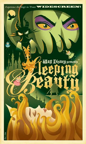
Here is Eric Tan's "Sleeping Beauty." I like how the hair looks like fire. :)

And here are 2 old horror posters from my Pinterest board

Eric Tan made poster-styled art for other Disney Princesses too.

Monday, February 6, 2012

Troy & Abed Shirt

I have a lot to blog about including Johnny Cupcakes! But for this post, I'm going to return to Megan Lara who has done Art Nouveau style T-shirts.

"Dope Adventures" T-shirt
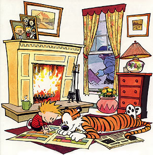
Today on TeeFury.com, Megan Lara has a T-shirt of Troy and Abed from Community in the styled of the comic strip "Calvin and Hobbes."
At first I was a little disappointed that they don't look much like Troy and Abed. But then I thought about their relationship. Troy is the boyish innocent one while Abed is the rational one. So Megan Lara matched up the personalities well.

And then I looked at the details. If you know Troy and Abed, then you will appreciate the comic title "Kick-Puncher." =) They have also like blanket forts, and they now room in one in at the end of season 3. The little mug says "Special drink,"  which I think refers to Abed's chocolate milk recipe. So Megan Lara has succeeded in putting Troy and Abed elements in the "Calvin and Hobbes" setting.

You can get the shirt HERE for $10, but only for 8.5 more hours of today. The web page has a countdown for the duration of the shirt sale. Afterwards the shirt will no longer be sold at TeeFury. You will have to find the shirt on another website, which will sell the shirt for at least $20.

Here's a picture of "Calvin and Hobbes" for those of you who need an introduction to them:
Calvin and Hobbes

You can read the comic strips in book volumes now. Some adventures, including the great ones, last more than one strip. The names were chosen from philosophers John Calvin and Thomas Hobbes. Hobbes the tiger is actually a stuffed animal that Calvin imagines as a real tiger and his best friend.

There's no fooling myself now that I'm nostalgic and sentimental. I will get the shirt!

Monday, February 7, 2011

MegaMind - appearances

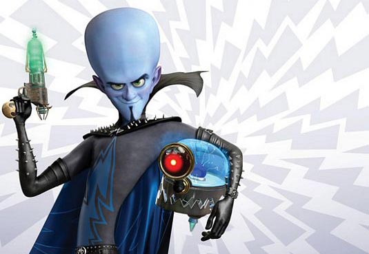
Just saw MegaMind at a $3 theater.  I did not expect much from the movie, but I found myself laughing and  surprised.  Also, it has a lot of character exploration for MegaMind.  Along with learning his life story, I think the audience cares for him because his character design is not all threatening.

From memory, I thought MegaMind had a sharp, pointy chin but he doesn't. Although the lower portion of his head is angular, his head is mostly round.  Sharp angles look threating while round is safer.  Yes, he does have the sharp studs, but they're tiny.  His collar too has points, but it rounded with the curves like his elbows. His body too creates a long curve.  The long, skinny body makes him odd-looking, which could be perceived as strange enough to be feared.  However, he says odd, funny things so the odd look is considered funny as well.

Aku from Samurai Jack has pointed ends, edges, and angles that make him look like a real threat. Look at just his teeth.  The way they curve out is strange, which this time does evoke fear. Aku can be funny sometimes but he is still recognized as a threat.

Look at these two:

MegaMind looks threatening only by the larger studs.   The collar is taller now but has lost its points. Titan/Tighten on the left looks more menacing just by his expression.  His face is round too but more angular than Mega Mind's face. Perhaps the Tighten's fiery colors add to the threat. He looks like dangerous fire.  MegaMind could look threatening with the blue and black by evoking a cold and dead personality but he shows emotions that gain sympathy. The red/pink/purple on his ears, nose, and cheeks too make him look less dead. The color reminds us that he's a living being with blood running through him.

Overall, MegaMind looks like a villain but he doesn't sell it like Aku and Tighten.

Although I'm talking about a movie, these visual factors can apply to a prose description of a character too.  A villain with a sharp chin rather than a round or large chin sounds more threatening. Colors can also portray the character's personality and nature but because the reader has to visualize the image, just a few colors should be used at a time.  An author points out the features to look at by stating them.

It's up to you writers and artists if you follow or break down the first impression of characters, but a first impression should be given for the audience to react to the character's arrival.