Showing posts with label details. Show all posts

Sunday, November 23, 2014

Katniss Art Nouveau

I haven't seen Mockingjay yet, but here's a beautiful Art Nouveau styled piece by Megan Lara:

Available at Society 6

Most of the story elements shown are also Katniss' identity. The fiery dress from the 1st Hunger Games movie falls down, and Katniss is in her real image (from the 2nd movie Catching Fire).

I'm assuming the flower is the one her father named her after. More obvious elements are the silver parachute and the split mockingjay pin. The symbol of her home, Distract 12, is tucked in the upper right corner. In the background, the hexagons represent the force fields from the games. Maybe because Katniss pops out of the shapes, we're suppose to see her as free from the boundaries. Of course, not after hard efforts. 

Katniss, both the girl and flower, even overlap the French titles for "The Girl on Fire," "District Twelve Tribute," and "The Victory Tour." I think the message is that Katniss' real identity is beyond the games.

Thanks, Megan Lara for this beautiful piece and all the thought you put into it! :)

Monday, April 29, 2013

Disney Princesses Redrawn

"Snow White" by Chad Sommers
I found a great art book at the library called The Art of the Disney Princess. The Disney Princesses were redrawn in different medias including digital art. My favorite images are the simplistic ones, especially if they require a longer glance for meaning.

The book cover itself is breath-taking. Can you see the hidden image on the right? Artist Chad Sommers said he was inspired by Salvador Dali's surrealist art.


Snow White with eyes closed standing or lying down. A drawn frame surrounds her.
"Snow White" by Eli Trinh
I have to share the Snow White piece down below because it goes with my post The Monster and The Victim on how dead or sleeping woman are depicted as beautiful. At first glance, you think Snow White is standing up, but Eli Trinh must have drawn Snow White when she's unconscious/dead from the poisoned apple. The frame then represents the glass case she is placed in for all to view.


I recommend this book to artists and Disney Princess fans. I'm going to buy my own copy. :D The images will be inspirational for my horror poster parody project and even shirt design.

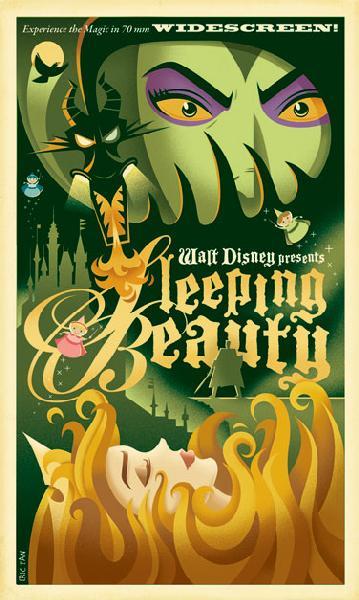
In fact, the last image I'll show is a Sleeping Beauty one that looks a bit like a horror poster.


Here is Eric Tan's "Sleeping Beauty." I like how the hair looks like fire. :)

And here are 2 old horror posters from my Pinterest board

Eric Tan made poster-styled art for other Disney Princesses too.

Wednesday, July 25, 2012

Using the Little Details

Click for a closer view of listed areas and details.
Johnny Cupcakes did a great job on the ice cream packages such as the sense of volume. Also, look at the suggested pressed lines in the ends. You get a sense of texture, making the image seem more tangible.

I appreciate that little detail because I do not enjoy reading descriptions that stray from the story too much and disrupt the flow.

For example, in I Robot: To Protect, the amount of detail given to food annoyed me most during a conversation. The narrator stated delight in the person on this date, but her attention was more on the food. Each described bite felt like a tree in my way as I tried to follow the conversation's direction.

Therefore, I try to describe to illustrate a character's feelings or to set the tone. If I describe to help the reader imagine an object, then giving tangible details like Johnny's pressed lines help the reader remember having felt the object before. Kudos to you if your readers feel as if they have held that object without having touched or seen it before.

The only thing I would change in Johnny's image is to make an edge of the package bend. This detail makes the representation less perfect, but more familiar. He wanted perfect symmetry though. Plus the package bend can draw your eye away from the main content.

Thank you to my sister for the Snickers ice cream bar at this moment. Now for ice cream that I can actually experience.


Wednesday, July 13, 2011

Beauty in the Familiar

When I edit a story, (like my Machine of Death entry) I refer to Writing Tools: 50 Essential Strategies for Every Writer by Roy Peter Clark. I refer to it like a checklist of ways to strengthen your writing. The book works for any form of written material.

One concept is to describe something ordinary and familiar as extraordinary.  "...[D]efamiliarization, a hopeless word that describes the process by which an author takes the familiar and makes it strange." Specific details can make the object seem unfamiliar to reader either because of one of the following:
*had a vague image when they read the object's name,
*have not seen the object in person (maybe just on TV),
*or have not notice the object's qualities before.

Here's a microphoto of grains of sand:


See how the familiar can become extraordinary and unfamiliar?  I don't mean for you to put everything under a microscope but think of what objects we overlook and what details make that object.

For more about the photo, click here.