Showing posts with label appearance. Show all posts

Wednesday, July 25, 2012

Using the Little Details

Click for a closer view of listed areas and details.
Johnny Cupcakes did a great job on the ice cream packages such as the sense of volume. Also, look at the suggested pressed lines in the ends. You get a sense of texture, making the image seem more tangible.

I appreciate that little detail because I do not enjoy reading descriptions that stray from the story too much and disrupt the flow.

For example, in I Robot: To Protect, the amount of detail given to food annoyed me most during a conversation. The narrator stated delight in the person on this date, but her attention was more on the food. Each described bite felt like a tree in my way as I tried to follow the conversation's direction.

Therefore, I try to describe to illustrate a character's feelings or to set the tone. If I describe to help the reader imagine an object, then giving tangible details like Johnny's pressed lines help the reader remember having felt the object before. Kudos to you if your readers feel as if they have held that object without having touched or seen it before.

The only thing I would change in Johnny's image is to make an edge of the package bend. This detail makes the representation less perfect, but more familiar. He wanted perfect symmetry though. Plus the package bend can draw your eye away from the main content.

Thank you to my sister for the Snickers ice cream bar at this moment. Now for ice cream that I can actually experience.


Saturday, November 5, 2011

The Hunger Games Cast Photos

I found cast pictures for the Hunger Games tributes (the game candidates). Here's a sunny, full-body shot. Note: Not all boys and girls are matched up by districts.
Click here for Vanity Fair's article with bios and character role tags to the cast photo. 
I thought the 1st girl was Foxface, but that actress will carry Clove's attitude. Gale looks too old. I do like the casting for Katniss, Peeta, Glimmer, and Cato. Rue was my favorite tribute so seeing her different than I imagined left me just accepting it, but the girl carries the right personality too. =) This shot though is of the actors not them as the characters so we can't judge too much by appearance. Their acting is what matters anyways!

I like these character movie posters, especially Haymitch and Effie:

By the way, I can't wait to read Catching Fire after the movie so I ordered it and will read it soon. I got the hardcover for $10 on Amazon! The next post will cover the other books I bought.

Monday, May 23, 2011

New Look

I'm changing my blog appearance to have more energy to it. =) Also, I finally got a potential banner. I'm happy with the logo look of the word "story" but still working on the rest.

What do you think?

Monday, February 7, 2011

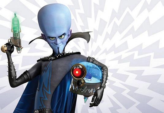
MegaMind - appearances

Just saw MegaMind at a $3 theater.  I did not expect much from the movie, but I found myself laughing and  surprised.  Also, it has a lot of character exploration for MegaMind.  Along with learning his life story, I think the audience cares for him because his character design is not all threatening.

From memory, I thought MegaMind had a sharp, pointy chin but he doesn't. Although the lower portion of his head is angular, his head is mostly round.  Sharp angles look threating while round is safer.  Yes, he does have the sharp studs, but they're tiny.  His collar too has points, but it rounded with the curves like his elbows. His body too creates a long curve.  The long, skinny body makes him odd-looking, which could be perceived as strange enough to be feared.  However, he says odd, funny things so the odd look is considered funny as well.

Aku from Samurai Jack has pointed ends, edges, and angles that make him look like a real threat. Look at just his teeth.  The way they curve out is strange, which this time does evoke fear. Aku can be funny sometimes but he is still recognized as a threat.

Look at these two:

MegaMind looks threatening only by the larger studs.   The collar is taller now but has lost its points. Titan/Tighten on the left looks more menacing just by his expression.  His face is round too but more angular than Mega Mind's face. Perhaps the Tighten's fiery colors add to the threat. He looks like dangerous fire.  MegaMind could look threatening with the blue and black by evoking a cold and dead personality but he shows emotions that gain sympathy. The red/pink/purple on his ears, nose, and cheeks too make him look less dead. The color reminds us that he's a living being with blood running through him.

Overall, MegaMind looks like a villain but he doesn't sell it like Aku and Tighten.

Although I'm talking about a movie, these visual factors can apply to a prose description of a character too.  A villain with a sharp chin rather than a round or large chin sounds more threatening. Colors can also portray the character's personality and nature but because the reader has to visualize the image, just a few colors should be used at a time.  An author points out the features to look at by stating them.

It's up to you writers and artists if you follow or break down the first impression of characters, but a first impression should be given for the audience to react to the character's arrival.